

Color theory is a fundamental aspect of art that involves the study of colors and their relationships. Understanding color theory is essential for artists, as it influences composition, mood, and the overall impact of a piece. In this post, we will explore the significance of color theory, its historical development, its application in different art movements, and provide practical tips for using color in your own artwork.
Historical Development of Color Theory
The study of color has a rich history, with significant contributions from scientists and artists alike.
- Isaac Newton: In the 17th century, Isaac Newton’s experiments with light and prisms led to the discovery that white light is composed of a spectrum of colours. His work “Opticks” laid the foundation for the modern understanding of colour.
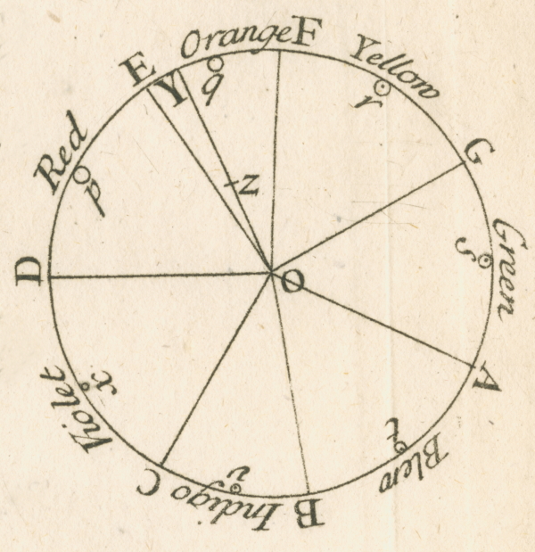
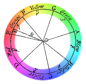
- Johann Wolfgang von Goethe: In the early 19th century, Goethe published “Theory of Colours,” which explored the psychological effects of colors and their emotional impact. Unlike Newton, Goethe focused on how colors are perceived by the human eye and their symbolic meanings.

Application in Different Art Movements
Color theory has played a crucial role in various art movements, influencing artists’ choices and styles.
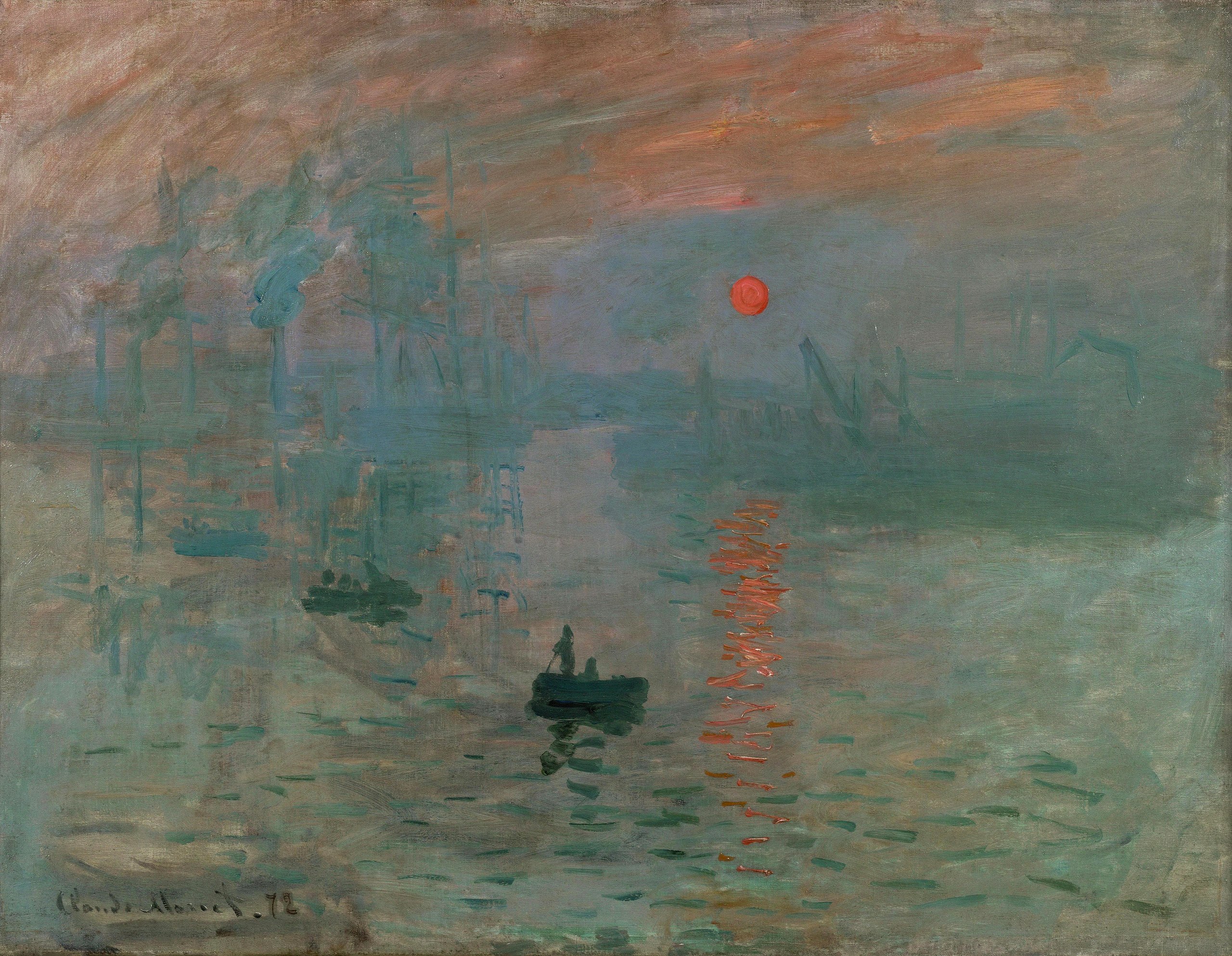
- Impressionism: Impressionist artists like Claude Monet and Pierre-Auguste Renoir used color to capture light and atmosphere. They often employed complementary colors to create vibrant contrasts and dynamic compositions.
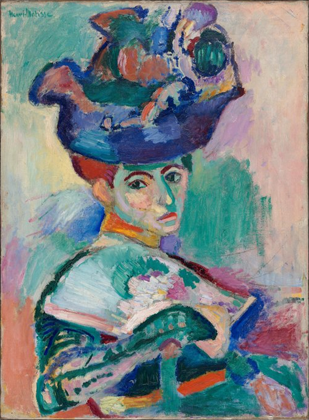
- Fauvism: The Fauvist movement, led by artists like Henri Matisse and André Derain, embraced bold, non-naturalistic colors. Fauvists used color to express emotion and energy, often employing contrasting hues to create striking visual effects.
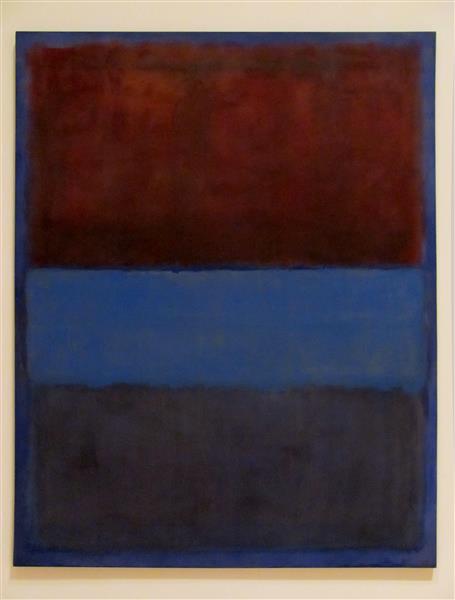
- Abstract Expressionism: Artists like Mark Rothko and Barnett Newman used color to evoke emotional responses. Their works often feature large fields of color that create a sense of depth and intensity.
Practical Tips for Using Color in Your Own Artwork
Understanding and applying color theory can greatly enhance your artwork. Here are some practical tips:
- Experiment with Color Schemes: Use different color schemes such as complementary, analogous, triadic, and monochromatic to create harmony and contrast in your work. Experimenting with these schemes can help you find the right balance for your compositions.
- Example: Create a painting using a complementary color scheme, like blue and orange, to explore the dynamic contrast between these colors.
- Consider Color Temperature: Warm colors (reds, oranges, yellows) can evoke feelings of warmth and energy, while cool colors (blues, greens, purples) can create a sense of calm and tranquility. Use color temperature to set the mood of your artwork.
- Example: Use warm colors to depict a lively summer scene and cool colors to convey a peaceful winter landscape.
- Use Color to Create Depth and Focus: Bright, saturated colors can draw attention to focal points, while muted, desaturated colors can recede into the background. Use this technique to guide viewers’ eyes through your composition.
- Example: Highlight the main subject of your painting with bright, vivid colors, and use softer, muted tones for the background elements.
- Study the Masters: Analyse how master artists use colour in their works. Pay attention to their colour choices, contrasts, and harmonies, and try to incorporate similar techniques into your own practice.
Colour theory is a powerful tool in artistic expression, influencing how we perceive and respond to art. By understanding the historical development of colour theory, its application in various art movements, and practical tips for using colour, artists can enhance their ability to communicate and evoke emotions through their work. Embrace the power of colour and let it transform your artistic practice.
If you would like to receive a roundup of all of our blog posts once a week to keep you inspired in your inbox, why not sign up to our newsletter. You can access our sign up at the top of our page. If you are a London Art College student and you would like your artwork featured here, drop us a line at any time.