Student Jane Tivey has created two wonderful drawings of her hands for her pastel course assignment. Read about how Jane created the drawings below.
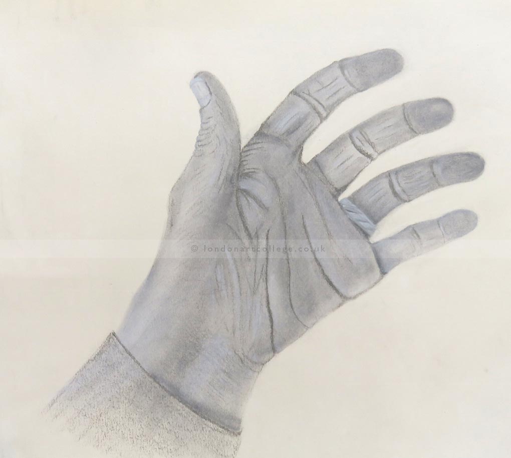
Tonal Hand – I decided to try with the back of my hand on the table with the fingers slightly bent. Initially though I spent a bit of time working out which colours were the best to use – I tried with a variety of soft pastels (including pan pastels and pencils) in different tones of greys and whites. I frequently seemed to get a very ‘bluey’ tone when trying to blend some of the pastels. I was also finding it difficult to achieve ‘crisp’ edges but I think that’s the nature of pastels.

Having finally sorted out which shades etc would work best I sketched the outline of the hand, very lightly, using a Derwent aluminium grey. I then used pan pastel Neutral Grey Tint 7 to ‘fill’ in the hand; from there I used Derwent pastel pencils aluminium grey, french grey light and (limited) french grey dark along with pan pastels neutral grey tint 7 and Neutral grey shade 3 plus white pan pastel and Derwent pastel pencil to achieve the creases and shadows etc of the hand. I have to admit that whilst I started drawing from life I had to use a photo after laying down the main structure as I couldn’t use pan pastels with one hand! I used a shaper and small sponges to blend and smooth lines.
Reasonably pleased with the final drawing after a bit of erasing and redrawing to get the proportion of the little finger right. Partly I think because it wasn’t as bent as the other fingers so looked as if it was a bit too long!
Paper used: Canson Mi Teintes – smoother side. The size of the drawing is 30.5cm wide by 27.5cm deep. I used the smoother side as it seemed to give a smother finish with the pan pastels.
Pastels used: Derwent pencils: Aluminium Grey, French Grey Light, French Grey Dark, Titanium White
Pan Pastels: Neutral Grey Tint 7, Neutral Grey Shade 3, Titanium White
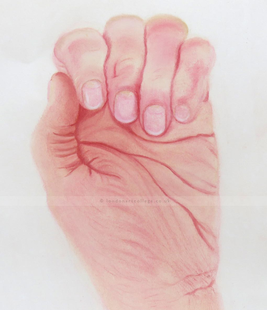
Coloured Hand – This was definitely the most difficult hand – because of the position and use of colours. I could have altered the hand position but thought this was more challenging than having the fingers long! I found skin tone really difficult to achieve. It took me a while to sort out the combination of colours that were best to use. I ended up using a selection of pastel pencils and soft pastels (some SAA and some Jacksons). I have included a photo of the soft pastel colours I used as I have no idea what their colour names are as all the label bands have come (or been taken) off.

I sketched the hand from life, but as I couldn’t maintain the position for long and blend the pastels I ended up taking a photo and working from that. I used the cream soft pastel to sketch and use as the basis of the hand. I sort of worked around the hand starting with the thumb then moving across the fingers and then working across the palm and down to the wrist!
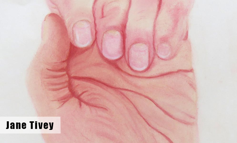
For the thumb I used the Pitt pastel to outline the creases and folds of the skin just layering to get more depth whilst also using the soft pastels to provide the main skin tones. The soft pastels used depended on the depth of the skin tone – in the main the cream and peachy colour blended to give the best skin tone with augmentation from the other colours to bring them closer to the colour I could see.
I effectively used the same approach for each finger and the palm until I thought the structure and skin folds and creases were more or less correct.
Paper used: Canson Mi Teintes – smoother side. The size of the drawing is 24cm wide by 28cm deep.
Pastels used: Derwent pencils: Titanium White, Pale pink, Flesh, Yellow Ochre
Faber Castell Pitt Pastel: 1122 – 91
Soft Pastels: See colour swatch below.

If you would like to receive a roundup of all of our blog posts once a week to keep you inspired in your inbox, why not sign up to our newsletter. You can access our sign up at the top of our page. If you are a London Art College student and you would like your artwork featured here, drop us a line at any time.

