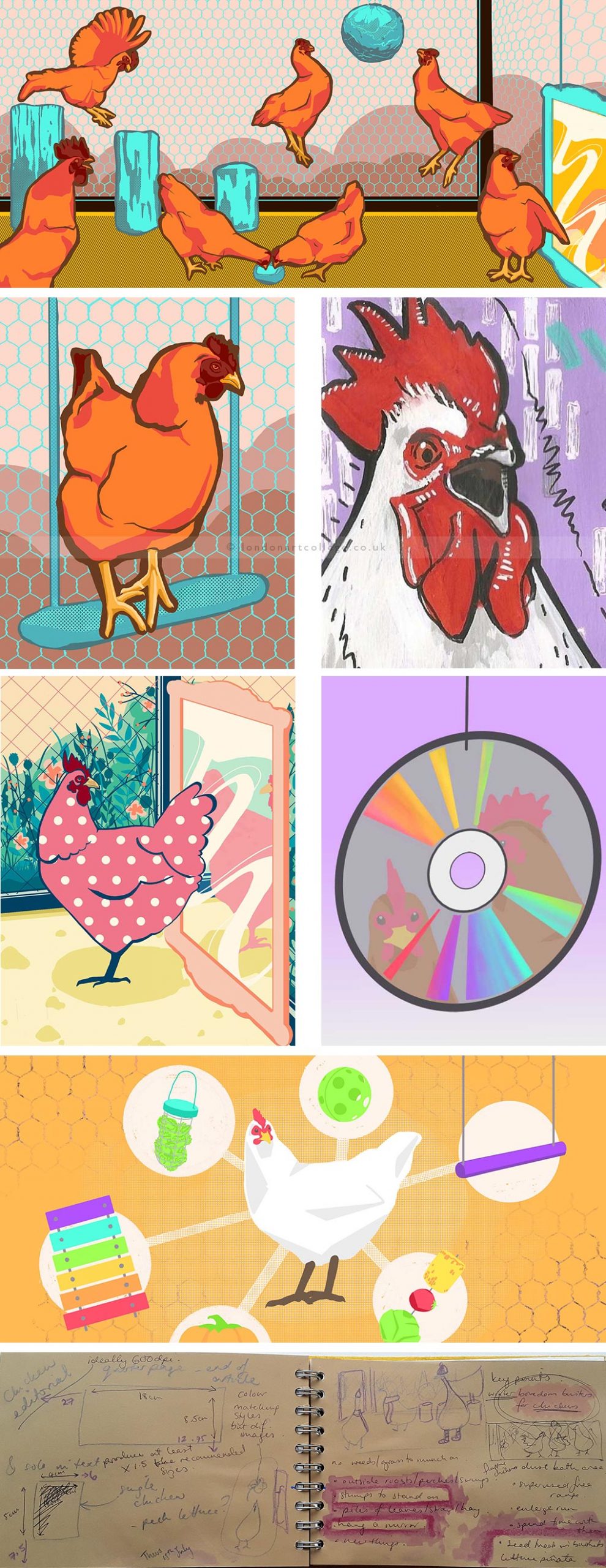
I had a lot of fun with this editorial exercise in the Illustration Course. We had to produce a quarter page and matching spot illustration for an article about chicken enrichment. I have chickens of my own so I really enjoyed the chance to spend some time drawing them! I spent a while sketching out my ideas for the illustrations and thinking about the brief and how best to work with the article and space we were given.
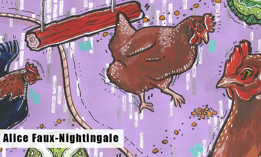
After this I filled several pages with small sketches of chickens and thought about colour schemes. I did a couple of watercolour and gouache drafts but I wanted to develop my digital drawing for this assignment so most of my work was done on the computer. I tried a couple of ideas for the illustrations before settling on my final design, trialling an infographic-style approach and a more floral version.
In the end I settled on a comic/poster style with bright colours inside the coop where the chickens were interacting with the enrichment described in the article. I definitely enjoyed the exercise and the opportunity to improve my digital skills, I’m looking forward to developing them more in the future exercises.

If you would like to receive a roundup of all of our blog posts once a week to keep you inspired in your inbox, why not sign up to our newsletter. You can access our sign up at the top of our page. If you are a London Art College student and you would like your artwork featured here, drop us a line at any time.

