

This was my favourite of the three exercises in this set. I was really wary to start with, so I did a graphite version first, so get a feel for the shapes and shadows, and I found that to be very useful in itself and I’ll probably do that more as the course progresses.
My coloured pencil version is A3 sized, Winsor and Newton Cartridge Drawing Paper, 110 gsm. I used my Verithin pencils and it took me two attempts to get a completed drawing that I was happy with. My first attempt was with my other Prismacolour pencils, they are thicker and waxier in texture and although I started out well, I soon found that I was overworking my layers and creating a messy picture, so I abandoned that one and started again.
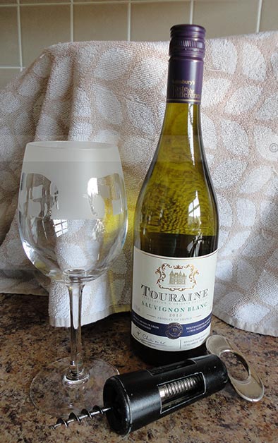
My second attempt took me a little over 9 hrs, which is a long time, but didn’t seem to take that long and I was surprised when I totalled up the time I spent on it. The very smooth texture of the paper worked well with these pencils and I kept a sharp point for most of the time, the hard ‘lead’ of these pencils was very easy for me to work with. I had really wanted to do this task and as the bottle I used isn’t a particularly fancy shape, I found the old metal bottle opener to add to the arrangement.
I think the bottle could do with being even darker, but I have reached the limit of layering with the pencils and next time I need to begin with darker colours and avoid starting out too pale as I did here. The glass was a challenge and a half! I like the end product, but it was certainly not an easy one to do. The bottle top alone took me an hour to get right, as I wanted to show that the top was shiny and reflective.
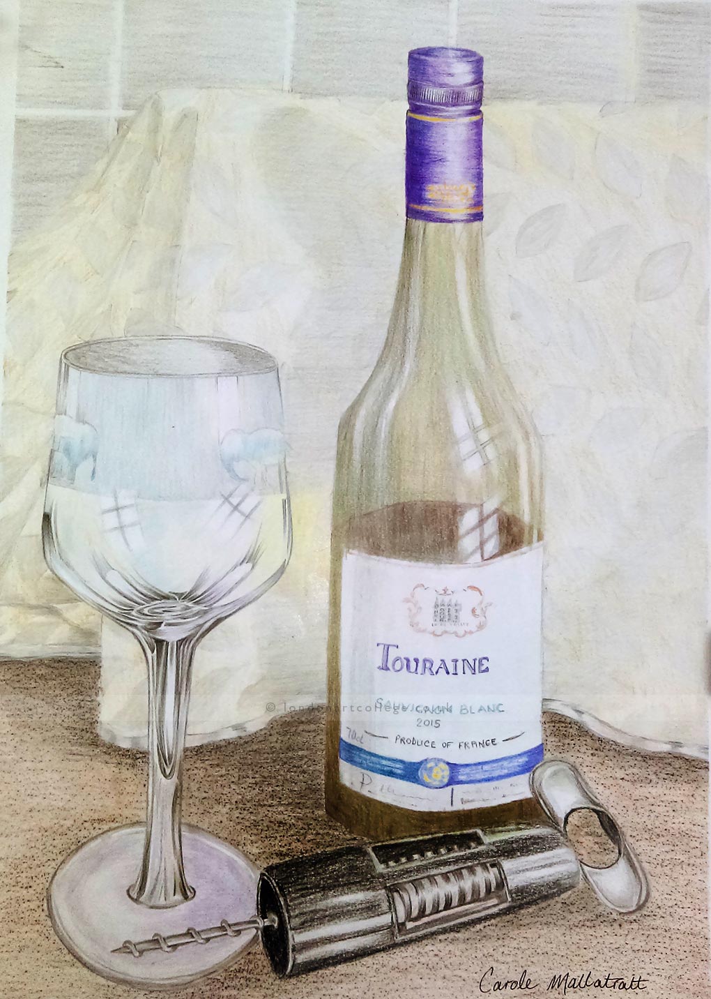
So far I have found out that layering and blending can be tricky to work on. I’ve been surprised at the colours I’m finding when I look more closely at my arrangements, for example the yellow/green reflection of the wine bottle, and the yellow reflection of the banana creeping into the peppers. I used sandpaper as a rough surface under my paper to create the mottled effect of my worktop beneath the wine bottle and glass. I loved that and already my mind is on the lookout for other course surfaces that may be useful.
If you would like to receive a roundup of all of our blog posts once a week to keep you inspired in your inbox, why not sign up to our newsletter. You can access our sign up at the top of our page. If you are a London Art College student and you would like your artwork featured here, drop us a line at any time.