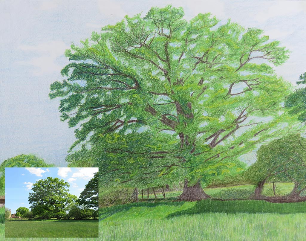
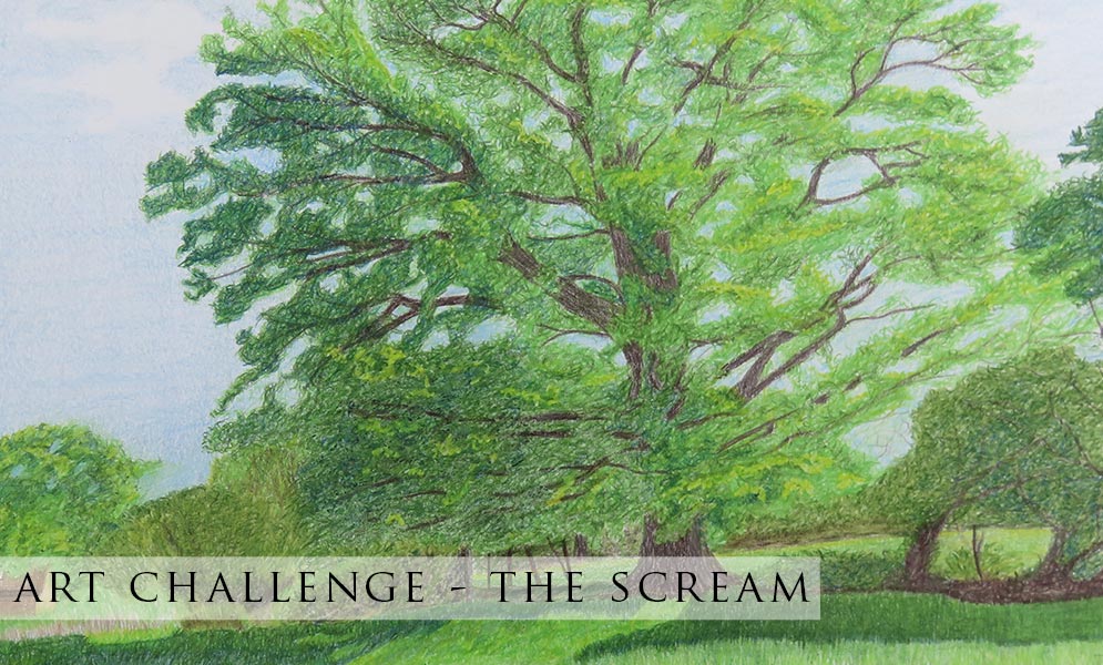
We have a wonderful blog post today by student Jane Tivey. She wrote a wonderful accompaniment to her artwork which we have added some of below. We hope that it gives our students and readers an understanding of how Jane tackled what essentially a very tricky subject – trees in coloured pencil.

“It was very difficult to duplicate the tree so after a few attempts to follow the structure of the branches and leaves I decided it was more sensible to capture the ‘spirit’ of the tree without necessarily capturing the tree exactly.
I sketched the tree out in Prismacolor Premier (PP) Apple Green and roughed out the placement of the other bushes and barn in graphite. Initially I used a couple of layers of light PP cerulean blue to lay down the sky; covered all the area occupied by the tree down to the bushes etc in the lower part. The basically roughed out the main areas of leaves in PP apple green using ‘scribbly’ lines so some areas of sky showed through, especially where there were the larger areas of sky could be seen through the leaves.
Once I was happy with the structure I drew the main branches in using PP dark umber and PP 70% French grey. Continued then to shape the tree to try and define the darker areas and grouping of the leaves; I used combinations of PP indigo plus a small amount of PP dark umber along with PP olive green and apple green.
The bushes and trees in the mid ground were created using the same colours as the main tree along with PP limepeel and Coloursoft (CS) yellow green. I used the dark umber and 70% French grey for the fence posts and some of the ‘earthy’ parts. The barn was PP light umber as the basis with sepia for the darker areas and sand for the end and lighter areas.
The grass in the foreground was under painted in PP spring green using mainly shortish vertical strokes; Indigo and olive green was then used for the shadow along with chartreuse and apple green for the sunlit area. The grass right at the forefront was then augmented with a combination of all the greens used plus PP putty beige and sand using short vertical strokes to create the the grassy effect.
I then went back and placed highlights on the tree using chartreuse on the leaves and touches of 50% French grey on the trunk and branches; I used an electric eraser in some areas to lift out some of the detail as the chartreuse wasn’t really showing very well. Also tried to blend the sky by using PP cloud blue and white. In terms of the time taken I would estimate it was 15 – 20 hours
Pencils used – Prismacolour Premier – Apple Green, Olive Green, Indigo, Dark Umber,70% French Grey, 50% French Grey, Sepia, Putty Beige, Limepeel, Spring Green, Chartreuse, Light Umber, Sand, Light Cerulean Blue, Cloud Blue
Coloursoft –Grey Green, White
Paper used: Bristol vellum surface, 11” by 14”, 270g/m2
Jane Tivey
Coloured Pencil Course

