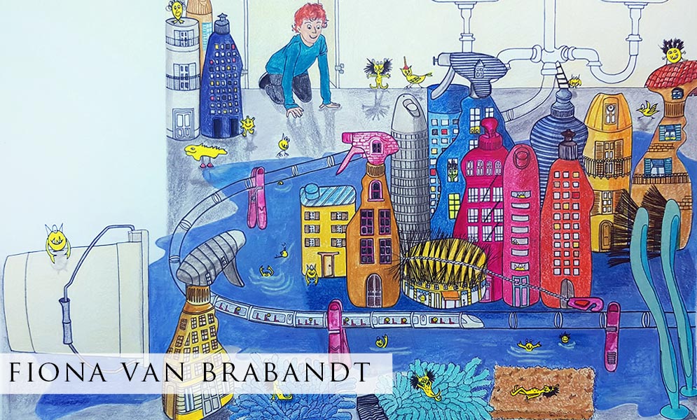
When I first read the assignment and when I looked at the various works done by students, Sebastian’s Sink City felt like a real challenge. I had never drawn or painted house-cleaning products and I was wondering how I would find the inspiration to work on the subject.
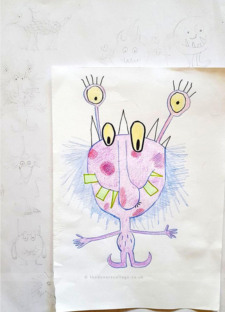
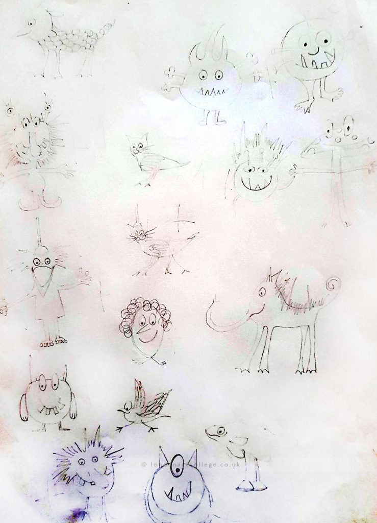
I did enjoy the idea of developing little creatures though. A few months before, my son (6 years old) had come back one day from school with a series of funny monsters he had drawn in class with his classmates. We sat down together during the week and drew more monsters which I found very amusing. I inspired myself of these monsters for the little characters in the exercise and the assignment. I sketched a few little monsters and then I asked my children which were their favourites and we made a little selection.
Exercise – The biggest challenge I found with the black and white pen exercise was working with light. As I couldn’t leave cleaning products outside on the table because of my children, I had to move them away every time and worked on the exercise during the evenings. As a result I had no proper light source which I found difficult to invent. This is why my black and white drawing appears rather flat. Shading and light is definitely an area I would need to explore more. I used a black nib and ink (for thicker lines) as well as a fineliner black pen.
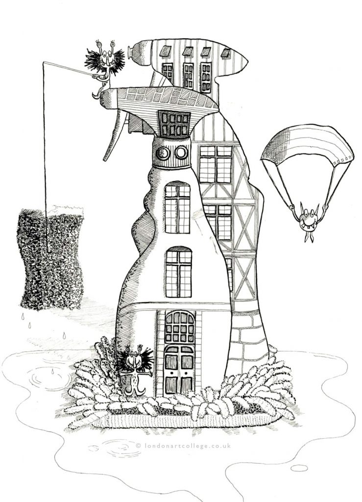
It was a good exercise though and gave me the opportunity to have a closer look at the beautiful works of Rembrandt and Goya around light.
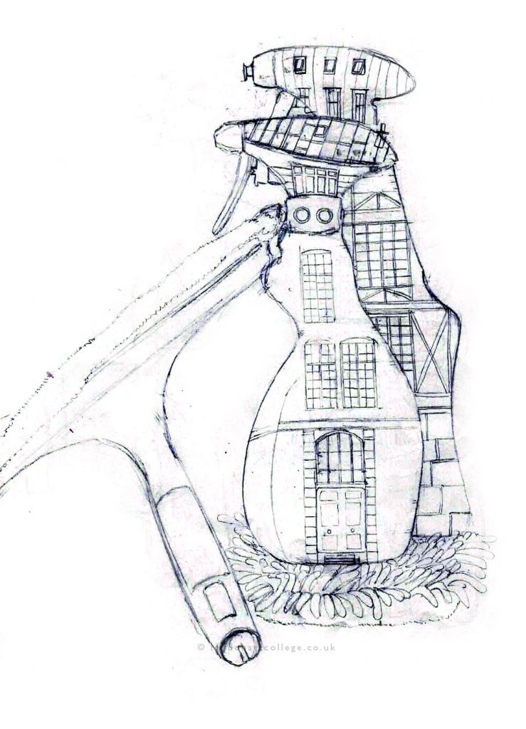
Assignment – For the assignment itself, I gathered various ideas. I already had my selection of monsters.
I looked at various futuristic cities and sketched out a city landscape. I looked at views of Paris to inspire myself for windows, roofs and used details for my buildings.
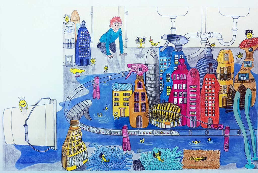
To make the city lively, I wanted to have a beach with creatures relaxing and also swimming. I used a sponge and microfiber cleaning gloves to give a little texture to the beach and added a few little creatures lying on them. I also added an aerial futuristic train to add to the busyness of the city.
I used mixed media: Pencil, colored pencils, acrylic and black pen. The coloring part took a long time and first I used only colored pencils which looked quite pale. I darkened the colors and then used acrylic paint to make some colors smoother. To make the buildings and people stand out, I used black pen which made things a bit clearer.
Initially, I decided to have a simple color palette with only primary colors. But then I added a few more colors such as pink and orange. Still I wanted to stay close to my initial primary colors. At the end I painted in the little monsters and to make them stand out, I tried green. This I felt didn’t work well, so I used a fluorescent yellow which fit better with the overall color palette.
I worked on the shading at the end and added a bit more shade each time.
One of the mistakes I made was the format of the page. As the two-page sheet was landscape, I didn’t realize that each page I was working were portrait format. So the page format is definitely something I will check a few times next time. Also the bleed trim marks were very pale.
Overall, this was a very good exercise where I learnt a lot, in terms of developing fantasy creatures, working with texture, light and shade, perspective, color palette and inventing a whole fantasy landscape.
Fiona Van Brabandt
Illustrating Children’s Books Diploma Course

