I chose the Editorial Illustration option for this set of work on the Graphic Design in art course. My first thought on reading the description was of the portraits produced by Giuseppe Arcimboldo using fruit and vegetables. However, I started out by collecting pictures from a Sunday newspaper food supplement and from Google images. It seems that photographs are the present fashion for illustrations of food rather than drawing.
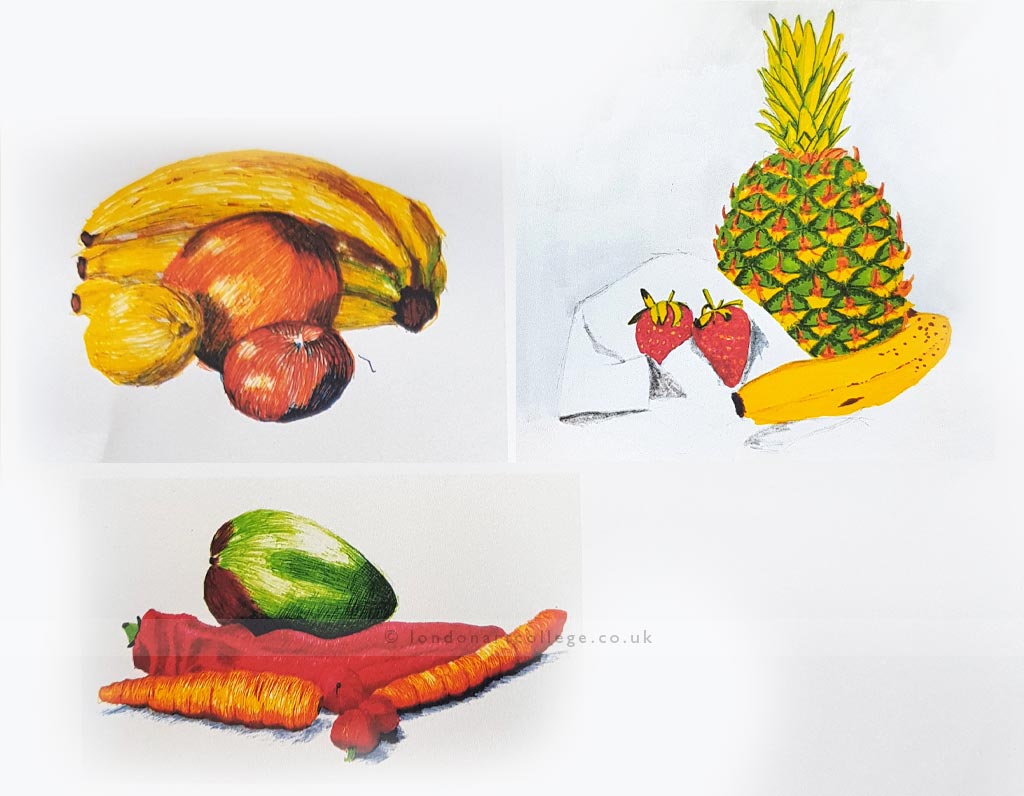
Next, I looked at some of my past drawings of fruit and vegetables to see if they would fit in to some sort of “Old Master” type of still life. On consideration, however, I decided it would not be interesting enough so I tried to think of alternatives.
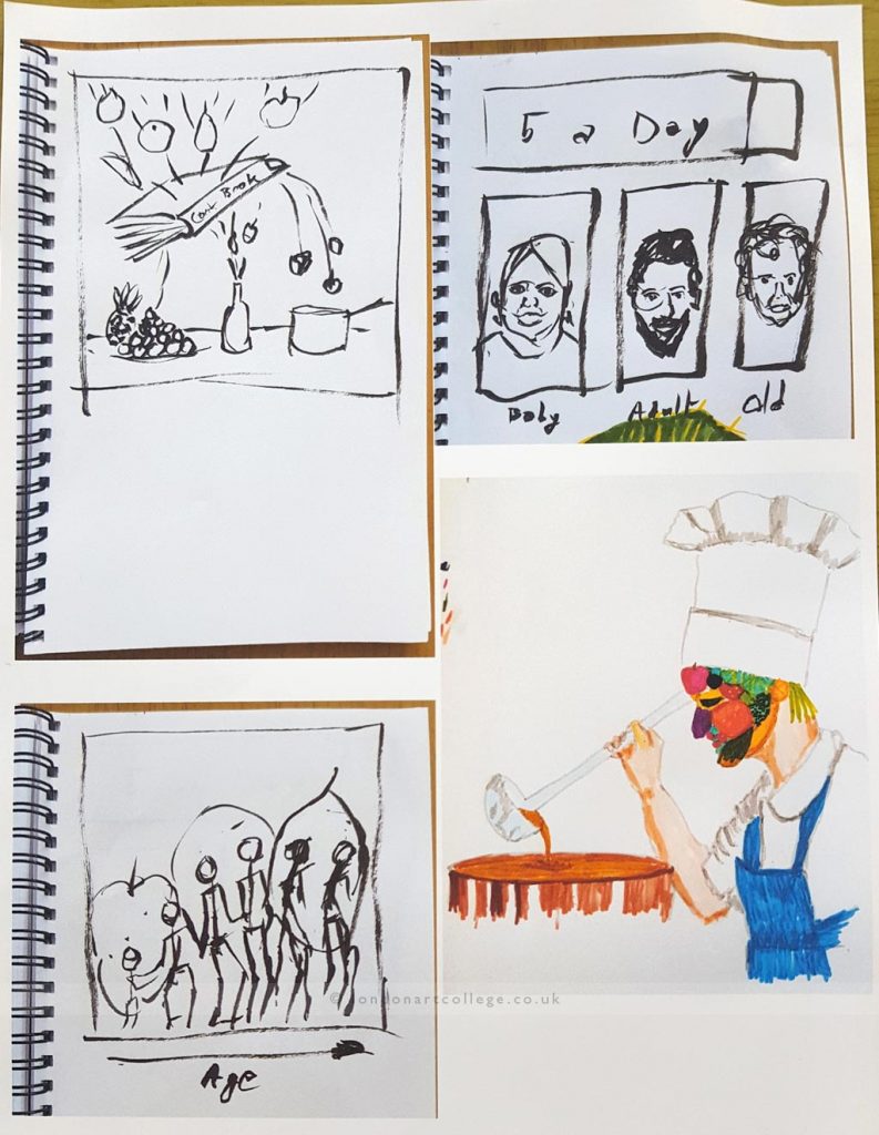
I had wanted to incorporate a form of still life in the style of a Cezanne or Bonnard, with the fruit on a checked cloth. Thinking about this together with the note I made about fruit falling down stairs I produced the top left sketch shown below.

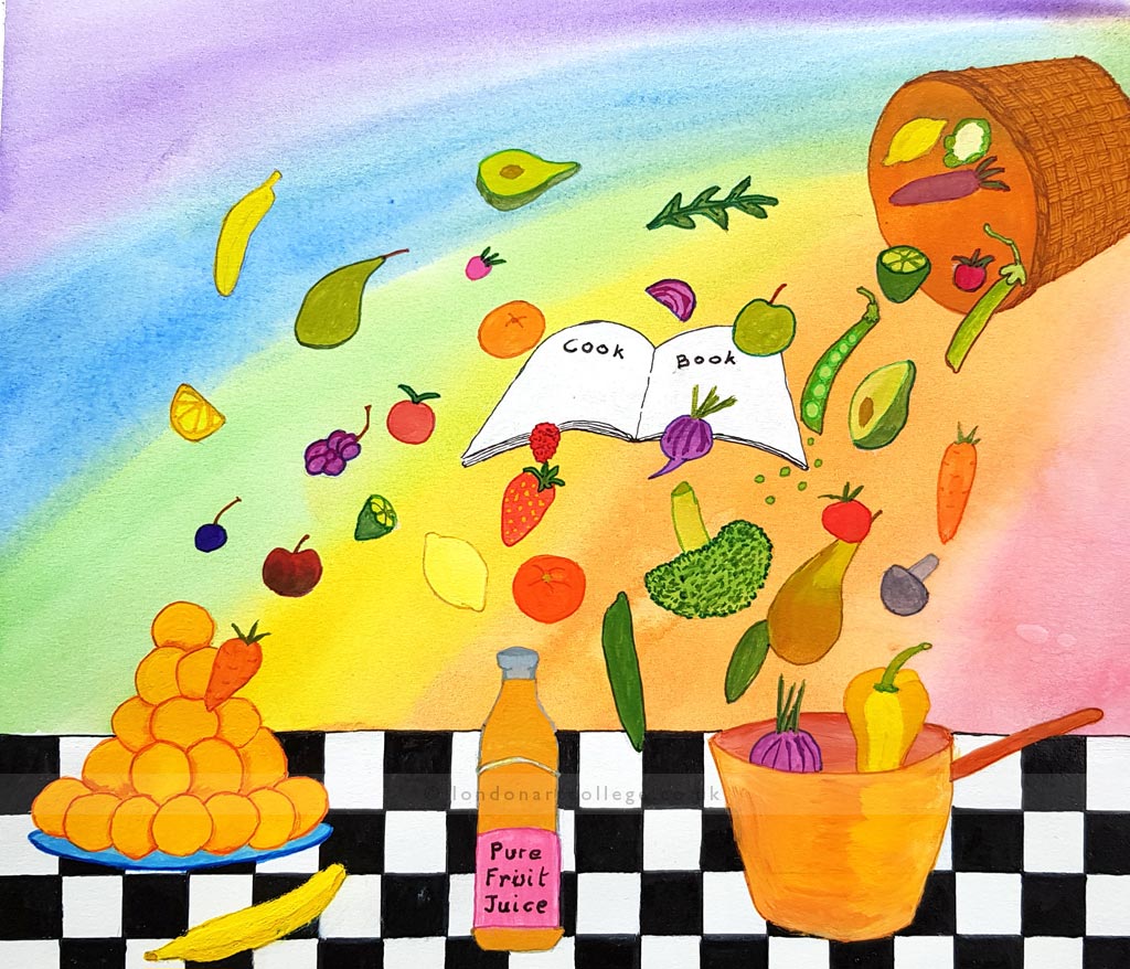
Since the assignment asked for sketches of other ideas, I tried an idea based on the phrase “5 a day” written in fruit above pictures of a baby, a young adult, and an old person. I rejected this on the grounds that it was a repeat of the article title. However, the age concept made me think of the evolution picture where an ape progresses through evolution to become a man. So, I thought of a progression from child, to teenager, to adult, to old person with different fruits and vegetables in the background. I continued to be more attracted to the idea of a dynamic picture of a basket dispensing fruit onto a cookery book where the fruit and vegetables would be directed onto a table, or into a juice bottle, or into a saucepan.

Having decided on the shower of fruit I used Inkscape to produce the chequered tablecloth, the book, and the basket at the correct size. This was printed out at full size and transferred, by hand, using a light-box on to a piece of Bristol board. I then chose to produce a rainbow effect, in watercolour, to provide a background for the illustration whilst alluding to the colours of fruit and vitamins. Then I inked in the tablecloth, painting in the basket and the book.
I feel that the illustration would have benefited from more items in the mouth of the basket and a greater variation in the sizes of the fruits from the basket to the table to emphasis depth and perspective. However, I am quite pleased with the resulting effect.

Philip Hickin
Graphic Design Art


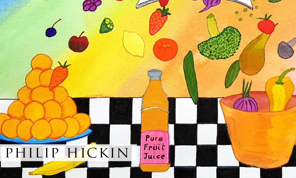
Philip’s ideas are well thought out. I particularly like the age drawings. The bottle of fruit juice looks good. I could just imagine that appealing in say, an advert. I am not artistic myself, but think his true to life pictures of fruit are excellent. Very colourful without looking unrealistic.
We are thrilled that you like Philips artwork Ann, we agree with you that it is all wonderful. We hope you continue to enjoy viewing the students artwork and reading the blog.