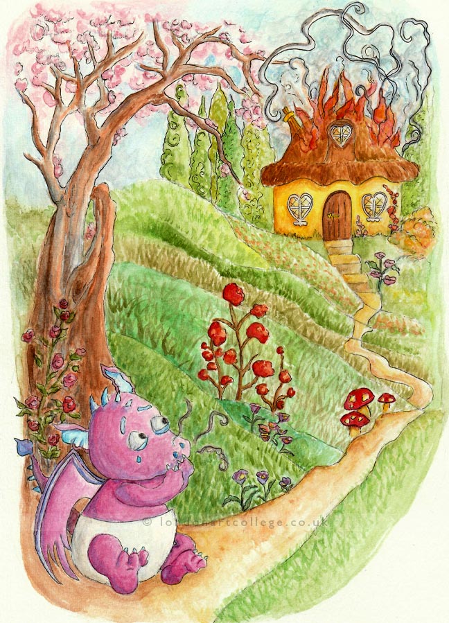
When planning for “Fiery Fred”, I immediately wanted to portray a scene depicting a fairytale/country feel and took inspiration for style and colour palette from Alida Akers’ work. I wanted the colours to gradually become warmer as they move away from Fred. However, as I progressed, I became worried this had created too strong a sense of sadness around the character for young children. Therefore, I added the tree to enclose the space behind him and hopefully create a sense of safety.
I always planned to have Fred in the foreground as he is the focus of the illustration. However, in my first sketch Fred’s shape was more elongated and his tail framed the bottom of the piece, but I felt the round body, shorter limbs, and proportionally larger head, were a more convincing way to show his youthfulness.
I also kept the outlining to a minimum as I preferred the softness conveyed and didn’t want to overwork the piece.
Grace Campbell
Illustrating Children’s Books Diploma Course