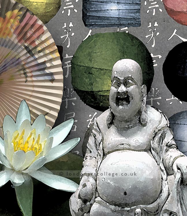
I have a beautiful piece of student work to share, it’s from Janet Malone. She chose to represent China whilst studying on my Graphic Design Art Diploma Course and has put together a super digital illustration.
I particularly like the way Janet has used contrasting tonal values to define certain forms within the composition. Such as the way the Buddha’s head is positioned against the darker tones of the lantern and the lower half of the lotus flower. This stands out so well when set against such strong, dark greens.
Janet has also included texture, by opting for an impressionistic style for some of the elements, including the Buddha and lanterns. The background Chinese lettering provides interest and decoration, without detracting from the main features. Well done Janet!

