If you have been following along, yesterday we showed Edwards Javier’s colour wheel step by step. Today we are following his oil painting which fits with the exercise ‘Light and how we see colour’. Edward is currently taking the oil painting course with Alan Dedman. hop on over to our website if you would like to have a go for yourself!
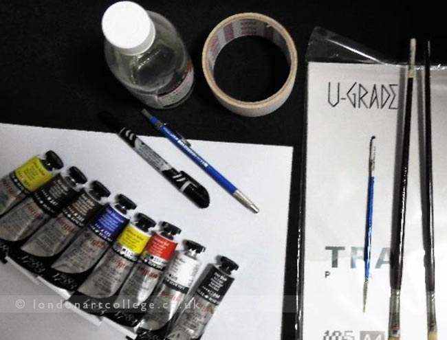
Materials :
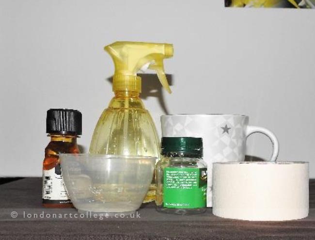
A picture of still life
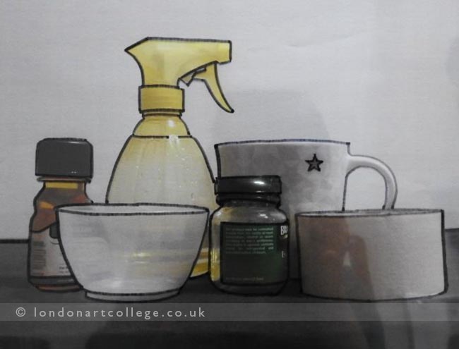
Acetate
Spirit based marker
Tape
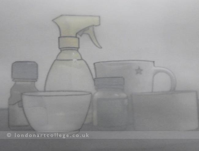
Tracing papers
Pencil
Turpentine
Oil painting brushes
Oil Paints : Cadmium Yellow, Cadmium Red, Ultramarine Blue, White, Ivory Black, Burnt Umber,
Still Life Setup – I arranged a few objects I can pick up and took a photo.
I had the photo printed out in an A4 sized paper.
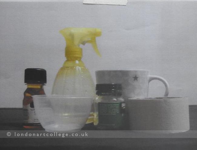
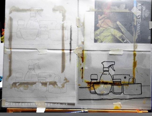
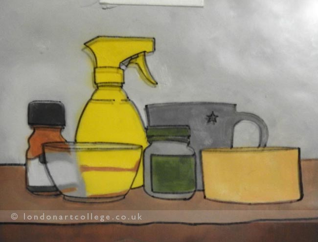
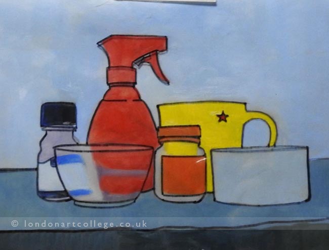
I traced the outline of the picture into an acetate paper using marker
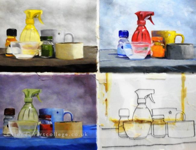
I aligned tracing paper on top of the acetate and started tracing the outline with pencil. I created 3 copies of the pencil drawing.
I painted on all 3 images.
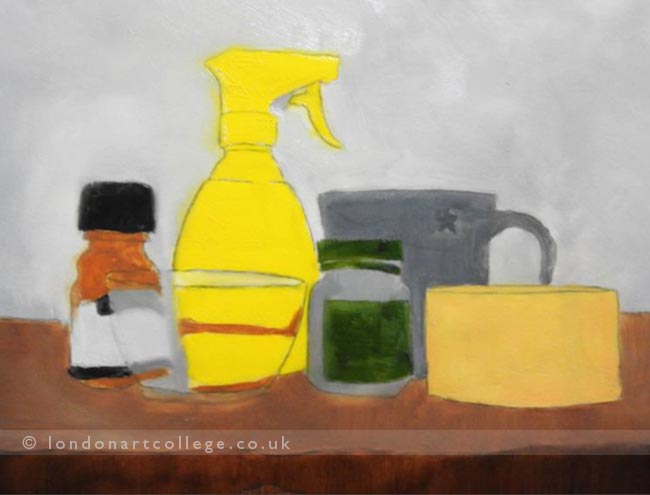
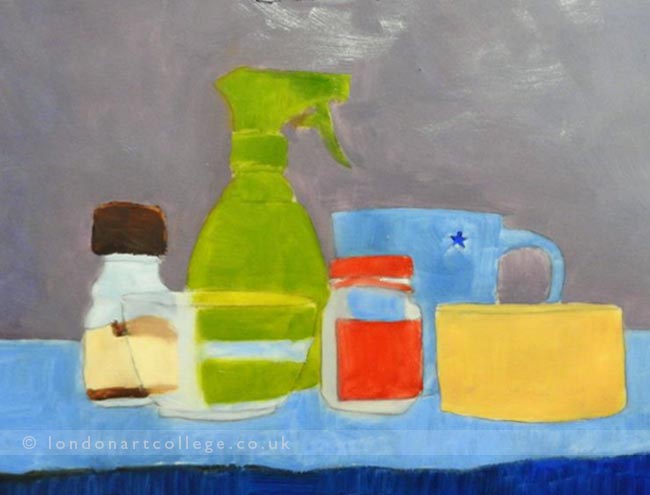
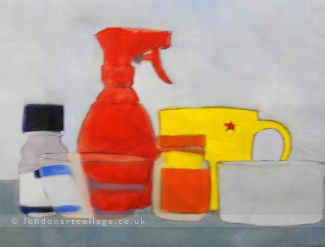
Three coloured copies of three versions of still life created with black outline.
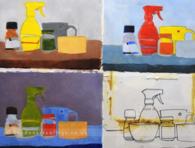
Image 1
Image 2
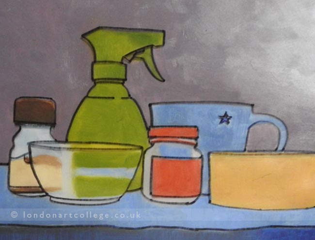
Image 3
Compare the colour schemes on the meaning of the original image.
Image 1 – I followed the colour scheme of the original picture. This colour scheme seems to give joyful vibe.
Image 2 – I tried to paint the image with cooler, darker colour. This image seems to give a more dramatic and gloomy vibe.
Image 3 – I tried to use the colour combination seen on sunset. Somehow, this image also gives me a gloomy vibe, as though the day has come to an end. Perhaps its because the background is a bit too dark.
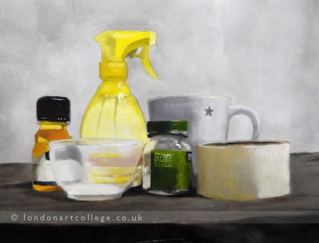
Making a final painting of the preferred colours.
Next instalment tomorrow….

