Natalia got in touch with us to ask if we would be able to add some of her artwork to our student gallery. We were delighted to be able to add them and we took the opportunity to ask if Natalia would write a little about her favourite pieces for our blog. We hope you enjoy Natalia’s post below. If any of our students would like to see their work here, or on our gallery just drop us a line at any time on –
techsupport@londonartcollege.co.uk
—————————————————-
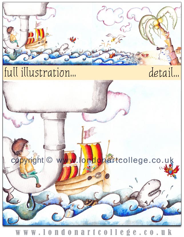
Sebastian´s Sink City:
This is the image I had in mind for a pirate world for Sebastian. I always imagined Sebastian sat on the sink pipe, enjoying the view of a pirate ship trying to get to shore in order to find treasure. Their parrot heading off to inspect the island before the pirates, but on the way, came across a hungry shark that tried to eat him! There is however, someone already on the island who has possession of the treasure and will not let it get away from him.
The technique I used was watercolour. I wanted to display vivid colours on the sea, animals and people along with the contrast using soft colours for the sky. I also tried to make the characters and animals look funny in order to appeal more to children. I hadn´t used watercolour technique in over a decade but I have found that the more I use it the more I learn from it. I am still experimenting with watercolours which can be tricky to use.
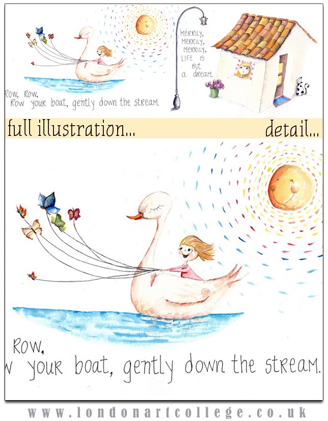
Row, Row, Row:
This little girl on a very tranquil swan, being pulled on by a bunch or colourful butterflies, suspended on calm and still waters, enjoying the best out of the suns rays. All of this is actually a day dream! She is just looking out from her bedroom window, imaging a thousand things in which she could be part of. Life is but a dream!
I had never had white backgrounds on paintings before. However, I wanted to give it a try and really liked the way it looks with the rest of the picture I think it adds to the peacefulness of the girl’s day dream. I believe the white background makes you focus more carefully on the character and the events of the story. I had initially intended to have a bubble/cloud thought coming from the girl’s head like in a comic book, but I decided to erase it and then edit it on my computer because, in my opinion, it had lost its charm.
I had to look up on the internet on how to make a nice effect on the terracotta tiled roof. What you see is lots of layers of paint with different tones and contrast in order to make that nice concave impression. I am vey happy with the effect.
It took me a couple of weeks to finish this piece. I think the original painting looks much better than the scanned copy because you can see and feel the texture of the paper and watercolour paint and that is unique.
NATALIA LUCIO BUNCH
Illustrating Children´s Book Diploma


