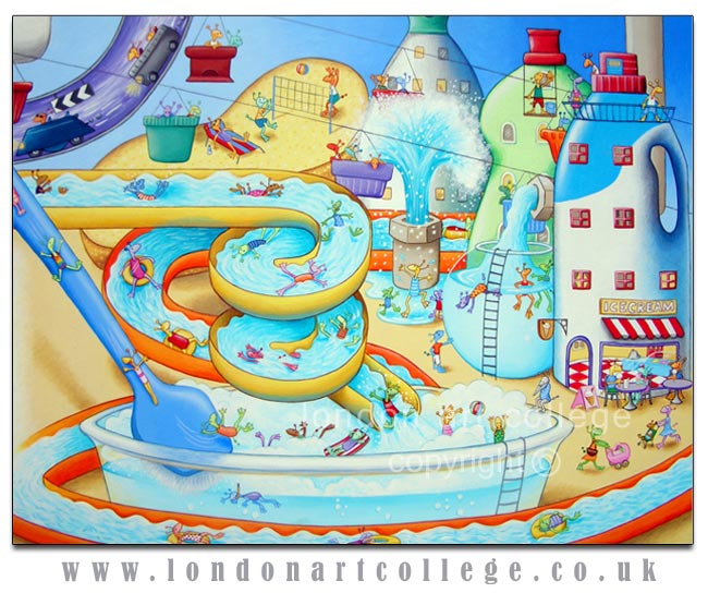
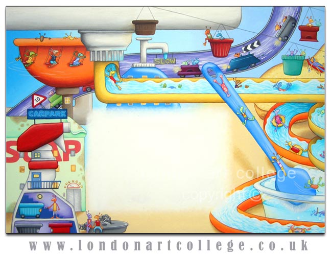
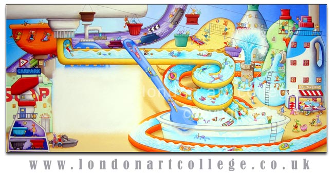
Maggy Roberts, the Illustrating Children’s Books tutor, asked one of her students to email her work to me to post on the college news blog and in the student gallery. The ‘Sink City’ artwork is fantastic and so I emailed Emma to find out if she could write a little about the artwork and her thought process behind it. I think Emma has created a very successful double page spread illustration and I hope that students here find it inspiring. Id like to thank Emma for writing about her work, you can view the full painting at the bottom of the post and two close up versions in between Emma’s text.
———————————————————————–
Hello! This painting was for the second brief of the Children’s Book Illustration course; Sebastian’s Sink City, which needed to be a detailed picture of an imaginary city beneath the sink, where structures and buildings could be depicted by household items you might find beneath a sink, such as squeezy bottles – and inhabited by little imaginary creatures. I approached this project with trepidation as it’s very much out of my comfort zone in terms of the subject matter, but I found I thoroughly enjoyed every aspect of this challenging brief – and it certainly was a challenge. Perhaps the hardest part was the composition of the entire piece and where to put everything. There was a lot of head scratching just getting the drawing right before I even thought about putting any paint on it – at one point I even drew some squeezy bottle towers on scrap paper and cut them out and lay them on the floor in front of me, swapping them about to see which way they looked best.
The underneath of most household sinks tend to be quite gloomy, but I wanted this picture to be the opposite of that; bright and colourful and energetic, something that would catch the eye of a child and hold their interest. Fairly early on I decided I wanted the city to have a really fun ‘holiday camp’ feel to it, so I turned the pipes into flumes to give them a water park effect, and added an ice-cream parlour as well. Then I added a few apartment blocks made out of squeezy bottles, and for fun I put in a cable car made from bottle tops. I also painted in a pipe through which little cars were zooming, and again bottle tops with little wheels added were ideal for those.
The little alien characters were great fun to paint; from the beginning I knew I didn’t want them all to look the same, so I made them all different colours and added swimming costumes and clothes with all kinds of patterns, and I made sure they were doing a variety of exciting things, from volley ball to swimming, eating ice-creams and whizzing around on swings, cleaning windows and even pushing baby aliens in prams. Part of the brief was to inject plenty of detail into this picture, and I kept on adding aliens until they filled every corner.

The painting is acrylic on thick paper, painted over a pencil drawing. I found colouring this quite difficult, because there were so many parts to it, and I wanted the colour to look well balanced and bright and varied, so I started off by doing a few pale washes of colour over the larger background areas, painting over anything that didn’t look quite right. I continued to build the painting up in layers, until the colours were opaque and smooth. I used fine detail brushes between sizes 00 and 02 to paint the aliens and other small details such as windows etc. I gave everything a fine outline in a slightly darker colour than the ‘fill’ colour, just to keep it sharp and make everything clear.
At one point I stood back from the picture and felt it looked quite flat, and so spent some time adding more shading to every part of it, which helped. Because it’s such a busy piece I was worried I might have overlooked some detail of it, but eventually I had to make myself put the paintbrush down as it’s the sort of picture you could always keep adding to and the risk is to go too far and spoil it. I definitely found this second brief more difficult than the one before, but it was a great learning curve in terms of constructing a scene, and I’d never painted this sort of subject before, so it has taught me a lot. A tricky project, but very enjoyable.
Emma Taylor (Illustrating Children’s Books Diploma D6)


