Our Graphic Design tutor Vanessa emailed me some pieces of work for the website from one of her students Kate. We also asked if Kate would like to write about them for our college news blog. We hope you enjoy reading about Kate’s artwork.
=============================================
I have been working with computer-based graphics for a few years, and decided to do the Graphic Design course to help me move out of my comfort zone and explore new ways of doing things. I have really enjoyed the course, and it has helped me to start thinking in a more conceptual way about designing, and to go back to basics using pen and paper to sketch and plan before jumping straight onto the computer!
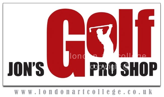
When I created the logo for a local company, ‘Jon’s Golf Pro Shop’, I decided to keep the original colours so that, in theory, the shop would not have to redo its interiors to try and match a new colour scheme. I chose a chunky, sporty-feeling font, and decided to try and make the logo more contemporary and unintimidating (as golf, and all the equipment that comes with it can, at times, feel very overwhelming) so that both experienced and newbie golfers would feel comfortable shopping here.
I added a silhouette of a golfer in the ‘o’ to give it a subtle golfing touch, and the various sized fonts create movement and energy, which is suitable for a sport-based logo.
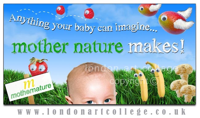
The next piece of work is a billboard for an organic baby food company – Mother Nature. I chose bright colours and chose not to clutter it too much, as you have only a few moments to get someone’s attention when they are driving (unless of course they are stuck in a traffic jam!)
I came up with the slogan ‘Whatever your baby can imagine… mother nature makes’. The term ‘mother nature’ used in this sentence gives connotations of the food being natural, pure and wholesome while also subtly bringing the company name into the slogan, to make sure people remember it! The brief was to focus on the wide variety of foods made by this company, which is demonstrated by ‘Anything your baby can imagine’. By referring to ‘your baby’ it also makes it much more personal to the reader’. With the baby’s head near the bottom of the billboard, it is clear that what is happening above his head is in his imagination – which is of course various fruit characters with eyes and wings!
Kate – Graphic Design Diploma

Thank you for writing such an informative article Kate. Your work looks terrific and I am sure that other students will benefit greatly from the design rationales that you have provided. I am delighted to hear that you find the traditional approach of the course useful, going back to putting pen to paper prior to transferring your designs onto the computer. I feel that by drawing ideas first you can really cover a lot of ground and stay focused on the brief, rather than possibly falling into the trap of becoming carried away with electronic effects that sometimes have no connection to the brief! Without a doubt, the computer has it’s place, but there is something more spontaneous and exciting when ideas are initially evolved on the page!
Thank you again for your article and congratulations on two super pieces of work.
Vanessa