Blog post by Julie Mulholland who is currently studying Illustrating Children’s Books Diploma Course with Maggy Roberts
I was thrilled with the comments Maggy made about my work and also for asking for it to be used on the website. I was doubly thrilled when Melanie asked me to write this blog. So please read my comments below which gives you a slight insight to the process of producing this illustration.
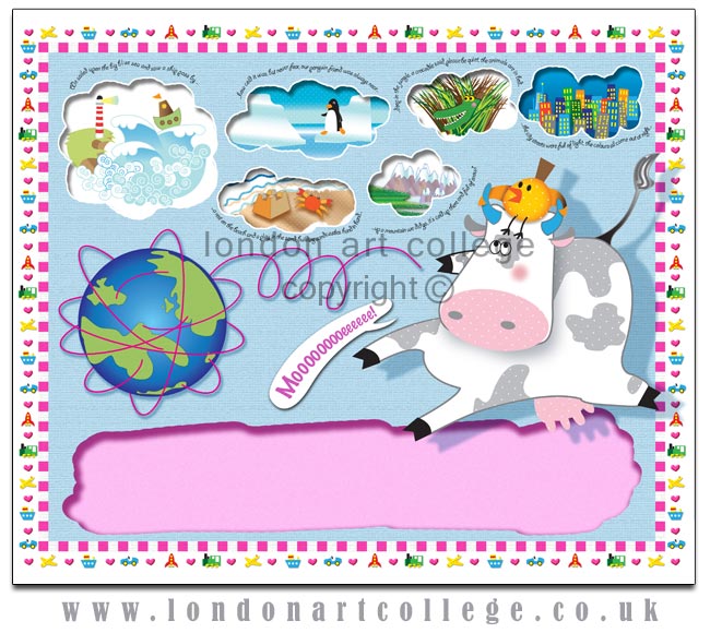
I looked at the brief for this particular assignment and sat thinking for a while. So many ideas came to mind and I sat trying to work out how I could put them all across and also onto just one page. Here started the problem. I knew I wanted the ‘Travelled Around The World’ part of the brief to be the main theme but there were so many options and image ideas running through my mind that I decided it would be quite nice to incorporate as many as I could into one illustration.
As I am working to quite a short deadline before the end of my course, digital seemed the right way to go and for me, it also had the correct feel for the brief keeping things soft but still light, colourful and strong.
I decide to attempt this image digitally because I wanted the flexibility of being able to use different textures and colour changes without the need to have to restart my illustration each time if something wasn’t quite working.
With Photoshop and Illustrator I had full control and could work on layers which helped enormously as I could play around with the background colours to get the right feel. I also wanted to get a 3D kind of effect to the main characters and this could be done much quicker digitally.
I wanted to keep the main characters key to the image, but not dominate the illustration, I also wanted a page that would draw the reader in and give some interaction between child and parent. i.e. lots of things to look at and talk about. I tried to put forward an image that would explain itself if there wasn’t any text to tell the story.
I tried to show the travel theme graphically by using lines around the globe which I think instantly tells the story and also by using transport illustrations around the border, it finished off the frame quite nicely. I wanted to appeal to boys and girls so used the squares pink/white border to hold everything together.
Overall, I enjoyed working on this brief and look forward to my next ‘challenge’.


Wow! Julie , it’s bright , attractive , interesting , really says it all and very very professional . I’m impressed . Celia Carlile