A writer’s experience of being illustrated
by Janet Foxley
Janet’s Website >>
Facebook >>
I had written stories for older children (unsuccessfully) for many years, and I also drew and painted a bit, so when I started to have ideas for picture books for the very young I enrolled on the London Art College’s Illustration Children’s Books. I had just completed the course and embarked on the extension course when I heard that my novel Muncle Trogg had won the 2010 Times/Chicken House competition for a children’s book by an unpublished author.
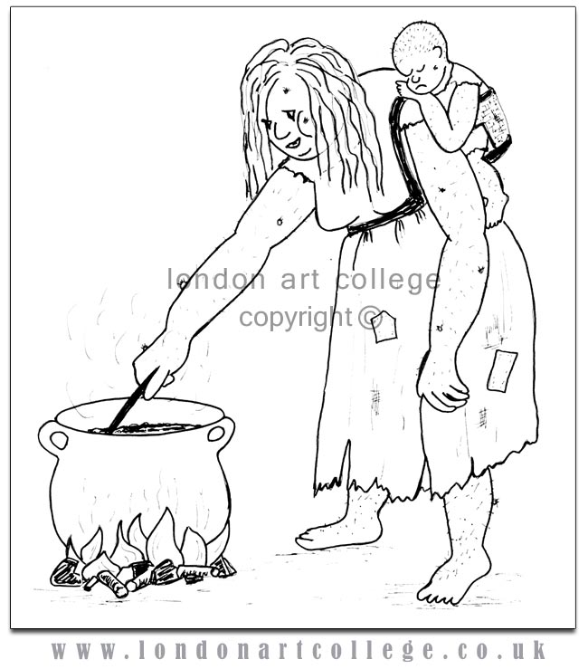
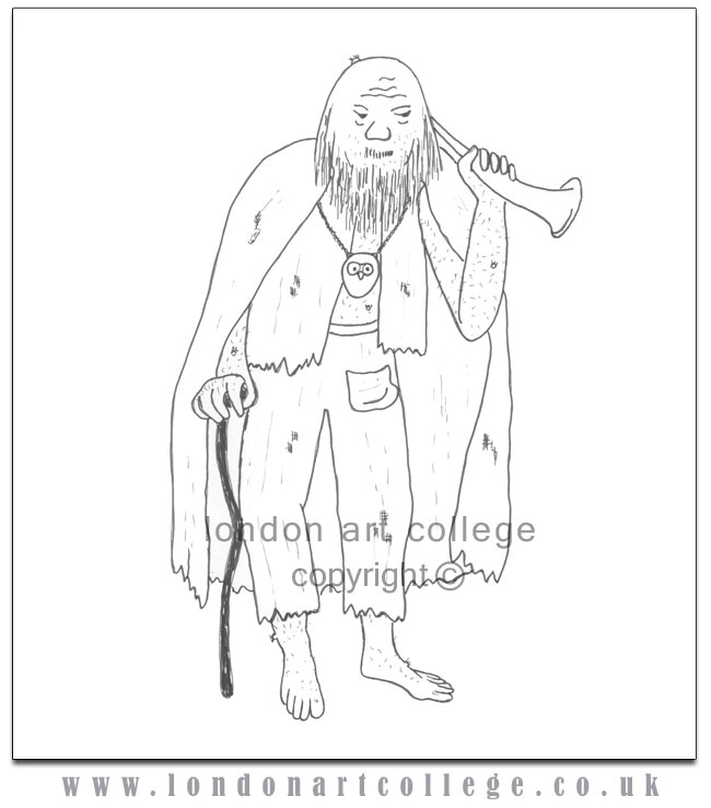
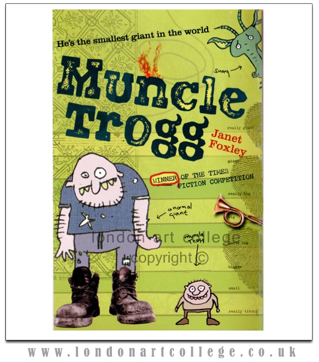
The prize was publication by Chicken House, and because it was to be marketed for quite young readers (7+ years) it needed black and white illustrations. They asked me to send them my ideas of how I saw the characters (who are giants) and suddenly I had to get used to how other people saw them. As a debut author I had no influence at all on either the illustrations or the cover and most of my preconceptions about they way in which illustrations add to a book have been overturned.
I sent them my idea of Ma Trogg:
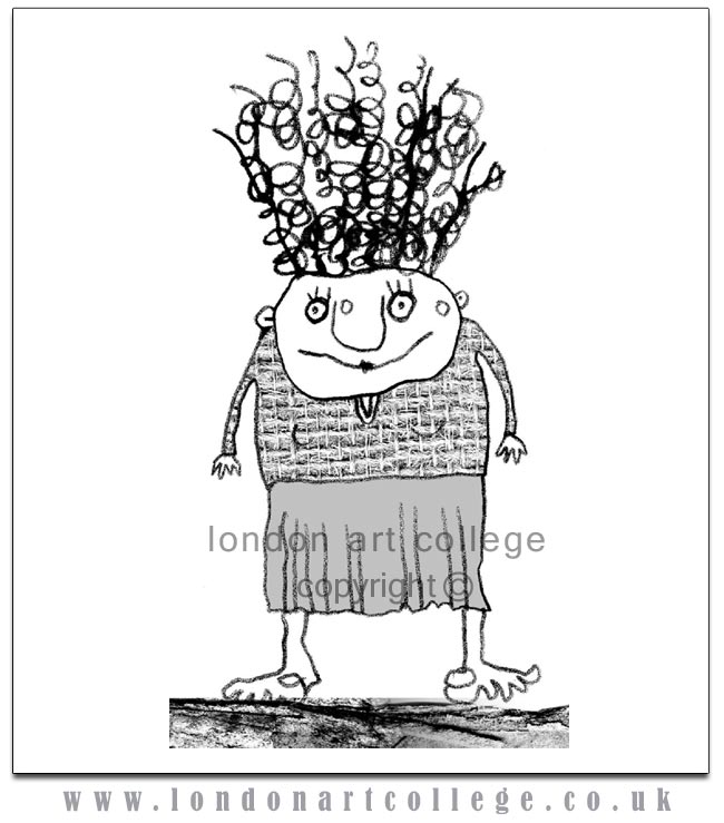
But the Ma Trogg they published looks like this (the hairdo is right for a special occasion but the clothes could have come from Marks and Spencer!)
My Wise Man:
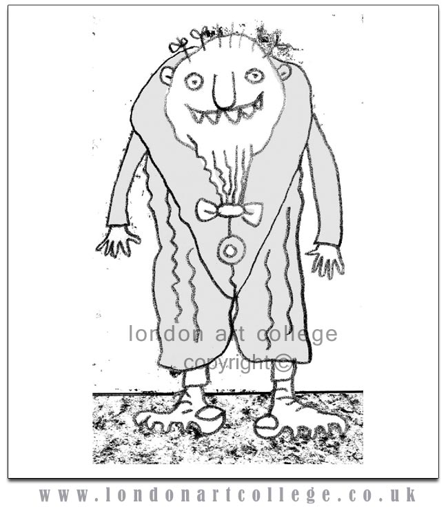
And their Wise Man: (The illustrations are by Steve Wells, a graphic designer who does most of Chicken House’s book covers.)
It was quite a shock to see my characters turned into childish doodles, but they assured me that this was currently the appropriate style for that age group. In addition all the pages have smudges, thumb prints etc to reflect the slovenly nature of the giants. The whole thing was designed to look rather like Cressida Cowell’s hugely successful How to train your Dragon series.
I soon got used to the style of the illustrations, but what I still find hard to accept is that the illustrations do not accurately reflect what it says in the book.
In the text the giants have long tangled hair, but in the pictures they have crew cuts. In the text Muncle is barefoot, but in the pictures he is wearing shoes. In one scene he dresses in knee breeches but the picture shows him in a lounge suit.
In the text the giants have grey skin, but on the book cover, the only coloured picture, they have pink skin. (Muncle has had to explain this away as an illness on his Facebook page!)
And what is that horn on the cover? It’s not in the book!
Some of the illustrations have had captions added, such as ‘who are you calling ugly?’ Now the story is told from the point of view of the giants, and they don’t find themselves ugly, so who is saying ‘who are you calling ugly?’ Apparently the pictures are supposed to look as if they had been produced by a child doodling in the book while reading it, and the captions are partly the child’s thoughts and partly the character’s response to the child’s thoughts.
So here are a few things to consider when you are illustrating a book:
• What is an appropriate style for the subject matter?
• What is an appropriate style for the readers’ age?
• What styles are currently fashionable?
• To what extent should the pictures reflect what it says in the text?
• Should the pictures be from the characters’ point of view or the readers’?
Janet Foxley August 2011
Janet’s Website >>
Facebook >>

Janet Foxley’s article is certainly worth reading for all aspiring illustrators. I’m baffled at why Janet won the competition if the publisher’s wanted a completely different style to what she submitted ! Did they know that she was versatile and could accommodate them. It’s very interesting. Her website has some very helpful links too. I love her work and her paintings are AMAZING . Celia Carlile ( Orlea1)
Janet won a writing competition though, not an illustration competition. Illustrator’s are not hired hands and shouldn’t be treated as such. Author’s cannot expect to art direct illustrators, that isn’t the way it works. Matching author/illustrator has always been the publishers job.
(Also, a HUGE congratulation’s to Janet – amazing achievement x)
Thanks Maxine , I completely misunderstood! I thought that Janet had won for her illustrations. It all makes sense to me now. Okay that’s fair enough and I must say that there’s something very modern and quirky about Steve Well’s illustrations . They are certainly eye catching. Celia Carlile ( Orlea1 )