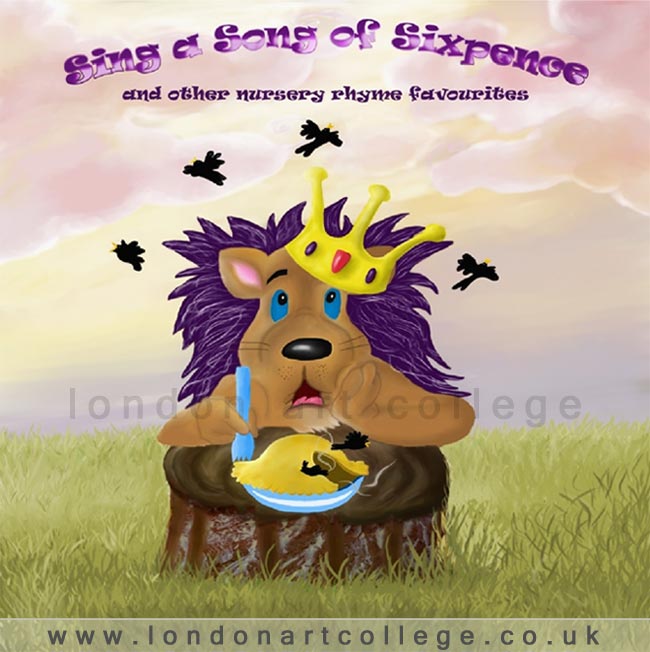
A graphic design student has created a super piece of artwork and has written about it below. The graphic design tutor Vanessa says…” It gives an insight into this students experience of applying a design to the computer. The result is terrific, achieving a bright, colourful CD cover that is very suitable for it’s target audience.”
I wanted to incorporate a king into the design, and eventually decided that because it was for a children’s CD, that I would make him a bit cute and an animal character. I sketched all of the elements for the design in pencil, then went over it in sepia as originally directed. I then scanned the images into the computer and worked the composition before then importing the file into Painter X. I decided that I would paint it in Acrylics as I like the brush strokes for this medium and so before I started to paint I applied a wood panel texture. I then put all of my highlight and shadow values in on another layer. I then added another layer and put in some warm colour tones. I then painted the background sky on another layer. I drew the clouds directly into the canvas and painted them. On different layers for each part I then painted all of the other elements. I then blended, repainted in some areas and touched up highlights before finishing the painting. I imported the whole file with all the layers into Photoshop, where I added the text and effects on the text such as gradients. To finish I added a curve adjustments and a levels adjustment before flattening the file and saving as a Jpeg. I wanted to paint it digitally as this is more relevant to my own work anyway and what I want to do for moving forward. I thoroughly enjoyed doing this, and am so glad that I got the opportunity to do so, although it took many hours! I am happy with the final result, although I learned so much doing this. There would be a few things that I would change about the way that it was done to make a better workflow and so improve the final result further. On a plus note though, my four year old son loved it and wanted me to print it out and put it on his wall – high praise indeed


This is truly stunning…what a beautiful piece of work…I really love the lion’s expression, just like a naughty little boy…the sky and the grasses are so naturalistic…really inspiring…well donexxx
Glad you like it! Im sure the student will be pleased to read your comment : )
Hi Sarah
Thank you so much, I am so glad that you liked it. xx
xx